01
See the signal before opening tickets
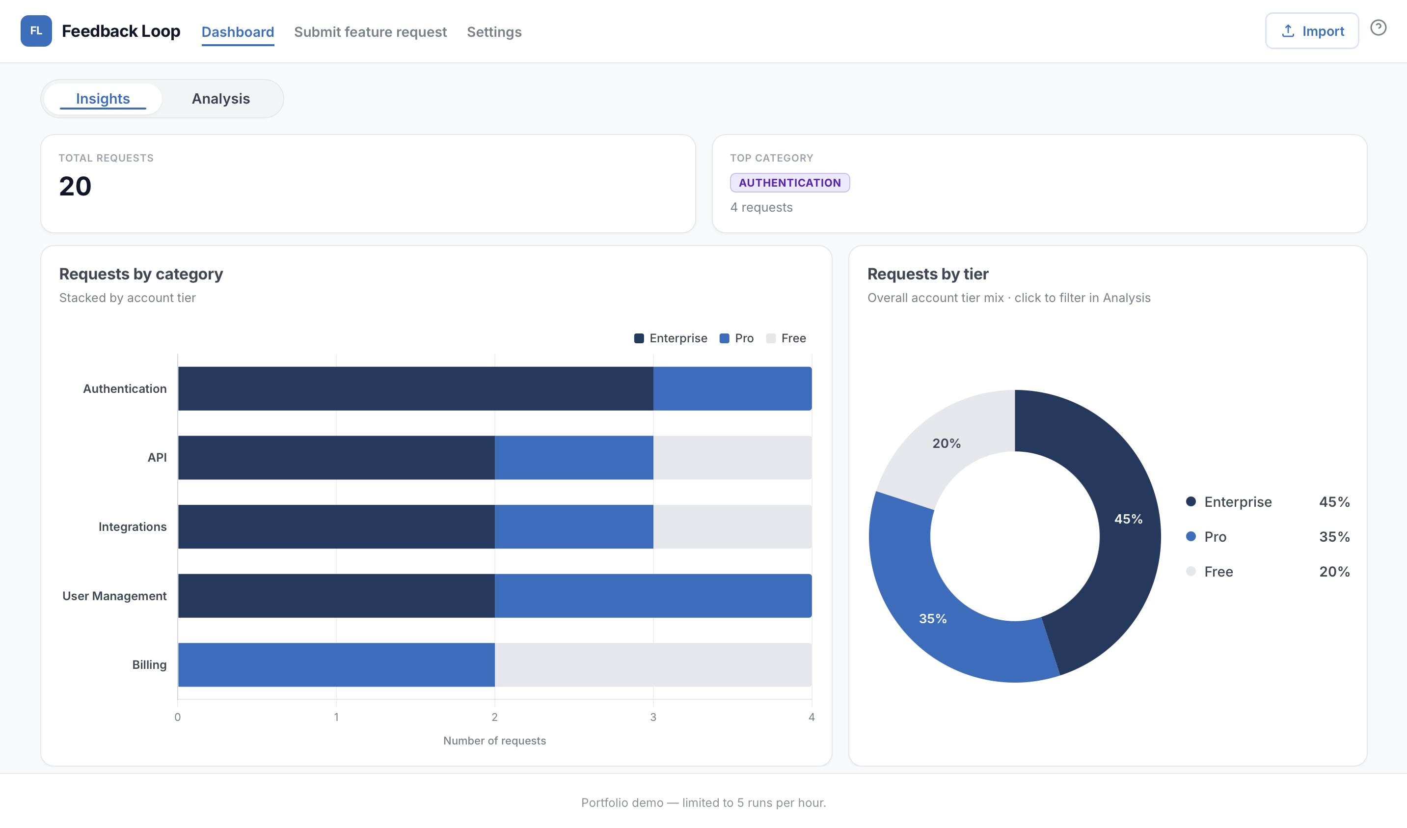
The Insights view turns individual requests into an operational picture of volume, product area and account tier. Chart interactions lead back to the underlying evidence in Analysis.
Voice of Customer · Product Operations · 2026
An AI-assisted Voice of Customer system that turns scattered support requests into structured product signals and an evidence-backed brief for Product and Engineering.
The problem
Feature requests rarely arrive as a neat product signal.
One customer asks for something in a support ticket. Another asks for the same thing weeks later. Over time, the evidence becomes scattered across different accounts, conversations, product areas, and customer tiers.
In support, I have seen how much manual work sits between "customers keep asking for this" and "Product or Engineering has enough evidence to act on it."
I built Feedback Loop to explore whether AI could reduce that distance by turning individual customer requests into structured, reusable product signals without losing the underlying evidence.
I designed and built the complete workflow, including structured request intake, CSV import, queue filtering, AI-assisted theme analysis, the Insights dashboard and PDF brief generation. I also implemented the Cloudflare Worker used to protect API access in the public demo.
The user
I designed Feedback Loop around two users who experience different parts of the same problem.
Support teams are closest to the raw customer signal. They hear the requests, understand the account context, and often recognise recurring patterns before anyone else does.
Product and Engineering teams need something different. They do not need another queue of raw tickets. They need patterns, affected customers, context, priority signals, and the original evidence behind the request.
The system therefore needed to preserve what Support knows while transforming it into something another team could actually use.
What I learned from the workflow
The project came from patterns I had already encountered while working in enterprise support and handling feature requests.
I noticed that the difficult part was rarely capturing a single request. The difficult part was recognising when separate requests represented the same underlying customer need and then making the case visible to the teams deciding what should happen next.
Frequency alone is not enough. Ten low-impact requests do not automatically matter more than one request blocking an important enterprise workflow.
Raw tickets are evidence, not a product brief. Product teams need the pattern and context without losing access to the original customer signal.
Support already contains product intelligence. The problem is often not a lack of feedback, but the lack of a repeatable way to aggregate and communicate it.
Workflow in practice
The Insights view turns individual requests into an operational picture of volume, product area and account tier. Chart interactions lead back to the underlying evidence in Analysis.
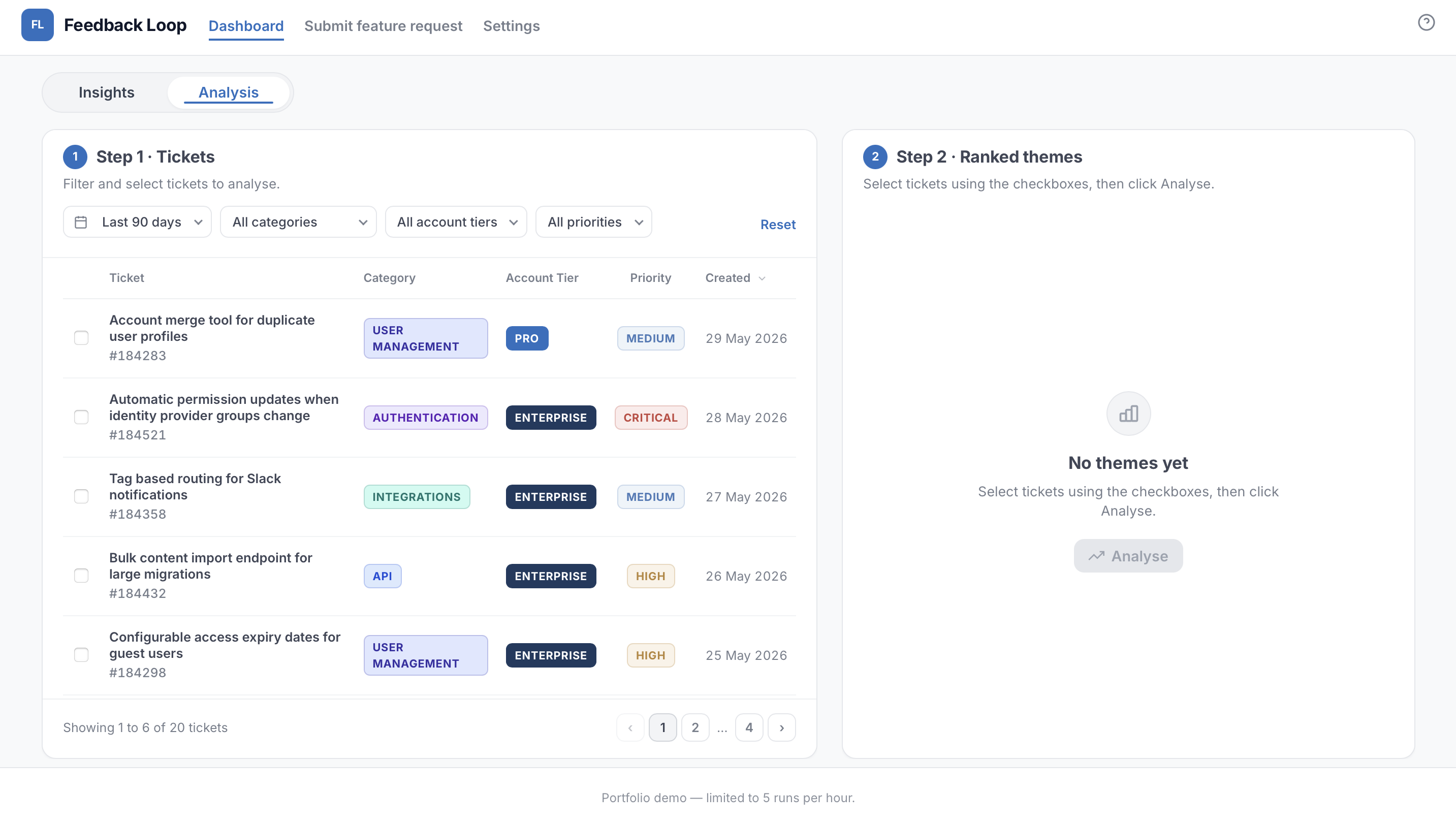
Support or Product can narrow the queue by date, category, account tier and priority, then choose the requests that should be grouped into themes. The source tickets remain visible throughout.
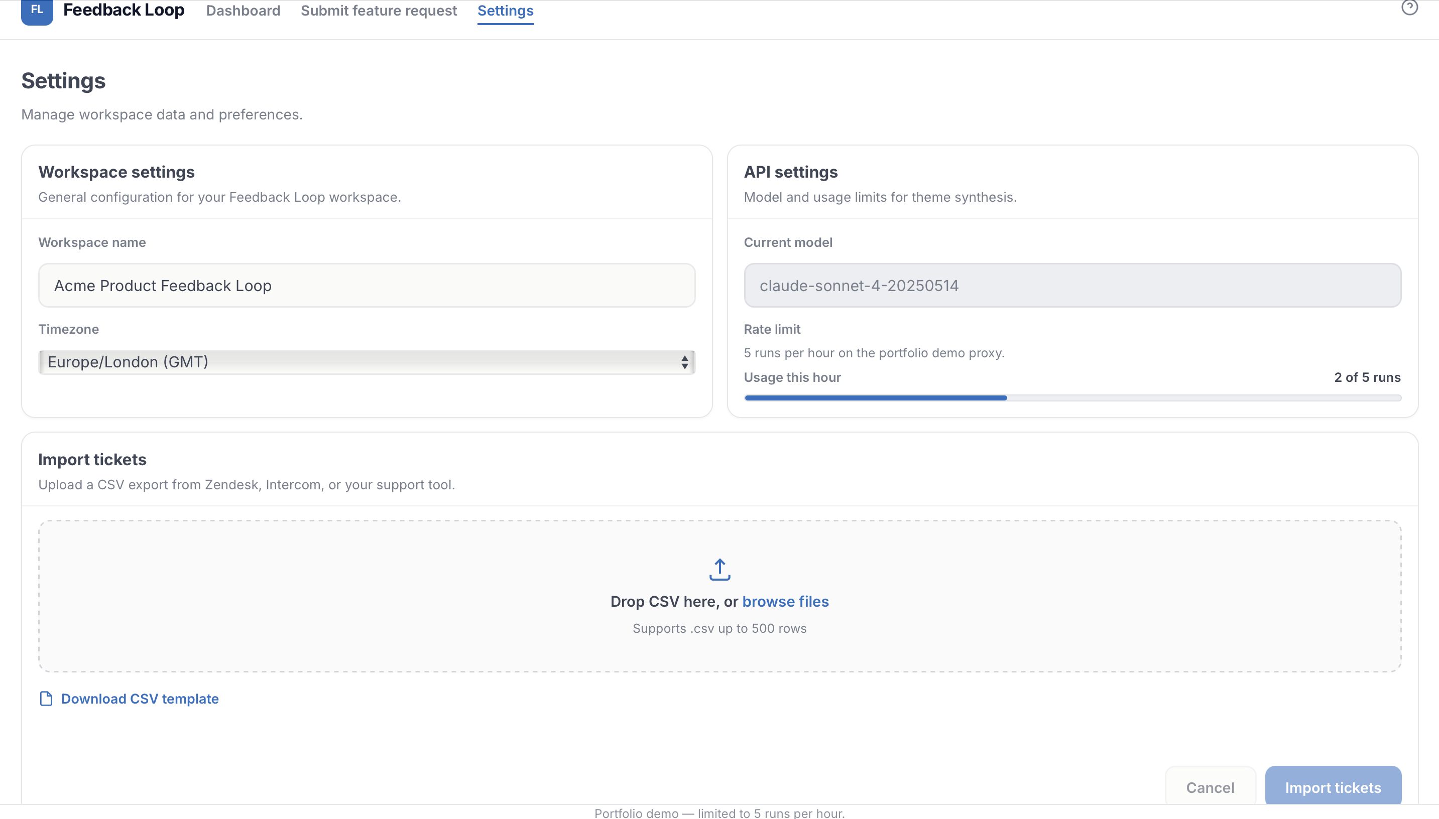
CSV import accepts exports from Zendesk, Intercom or another support platform. Teams can use the fictional demo data, their own imported data, or both without rebuilding the intake workflow.
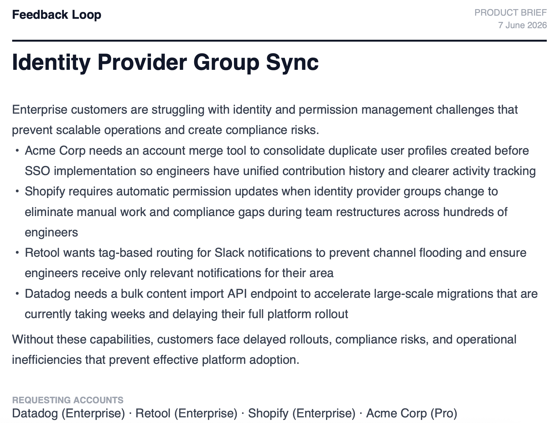
The final PDF packages the recurring need, affected accounts and supporting evidence into a format that can move into Jira or a product review without requiring another team to adopt the prototype.
Key decisions
Why group requests instead of summarising tickets individually?
Summarising twenty tickets still leaves someone with twenty summaries. The useful unit for Product is the recurring customer need, so the system groups related requests into themes while preserving individual tickets as evidence.
Why include account tier in prioritisation?
Request volume gives useful context, but frequency alone can flatten very different customer impacts. I included account tier as an additional signal so the analysis can show where demand is coming from rather than treating every request as identical.
Why export a brief instead of stopping at an AI summary?
The output needed to fit an existing workflow. A portable brief containing the theme, affected accounts, recommendation, and supporting evidence can move into Jira or a product review without asking another team to adopt a new tool first.
Why preserve the original ticket evidence?
AI can help organise the signal, but the customer request should remain inspectable. The generated analysis is a layer on top of the evidence, not a replacement for it.
The outcome
The finished prototype creates one continuous workflow from customer signal to product-ready evidence.
A support team can capture or import requests, see patterns across the queue, filter the underlying evidence, run AI-assisted theme analysis, and export a structured brief for Product or Engineering.
The project also moved beyond the original idea of automating feature request write-ups. The Insights view made recurring customer demand visible before anyone needed to manually investigate individual tickets.
If I deployed this in a real support environment, I would measure:
Reflection
I started this project thinking mainly about how to automate the repetitive work involved in feature request reporting.
Building it changed the question for me.
The more interesting problem is not "How do I write feature requests faster?" It is "How do we make what Support is learning continuously useful to the teams building the product?"
If I continued developing Feedback Loop, the next step would not be adding more AI. I would test the workflow with Support and Product users, measure where information is still lost between the two teams, and refine the prioritisation model around real decision-making behaviour.
Tech stack
Anthropic Claude
Theme synthesis and analysis
Cloudflare Workers
Secures API access and protects the public demo
JavaScript
Dashboard, intake, filtering, import, and storage
Chart.js
Request volume, tier mix, and trend visualisation
jsPDF
Generates the engineering-ready brief
Cloudflare Pages
Hosts the live demo
Cursor
AI-assisted development environment
Use the mock tickets already loaded or import your own CSV. Then explore the Insights view, filter the Analysis queue, run the AI-assisted synthesis, and export the final brief.
Open Feedback Loop →I am interested in Support Operations and Product Operations roles where I can turn customer evidence, recurring issues and operational knowledge into workflows that Product, Engineering and Support teams can act on.
Ask about my experience, skills, and projects